

Branding, explained
What branding is, what a logo cannot do, and when it is worth paying for.
A straight guide to branding for a small business: what the work actually covers, why a logo on its own changes nothing, how to research before designing, how to choose colours, type and a name that still work in five years, protecting it, and when the money is better spent elsewhere.

A logo is the smallest part of the job.
Most branding disappointment starts with the same misunderstanding. A business pays for a logo, receives a good one, and expects something to change. Nothing does, because a logo makes you recognisable and nothing more. It cannot make somebody want what you sell, and it cannot fix a price that is wrong for the market.
Branding is the whole set of things a customer uses to decide whether to trust you: the name, the colours, the typeface, the photography, the way you answer a message, and above all whether those stay consistent from one encounter to the next.
This guide covers what the work involves, what to decide yourself, and the situations where we would tell you to spend the money on something else first.
 By Nyah Eliud, Founder & Chief Strategist
Updated 20 October 2026
10 min read
Key takeaways
- A logo makes you recognisable and nothing more. Branding is the whole system customers use to decide whether to trust you.
- Answer four questions before any design: who the customer is, what they believe, what competitors look like, and what you want them to think.
- Test colours and type everywhere they will appear, including a photocopy, a profile picture and a sunlit phone screen.
- Check the domain, handles and trademark records before you commit to a name.
- Consistency is most of the value: one page of guidelines, applied to everything, beats a beautiful identity used haphazardly.
What a logo can and cannot do
A logo makes you recognisable. That is the entire job, and it is a real one: it is how somebody knows a van, an invoice and a Facebook page belong to the same business. What it cannot do is make anybody want what you sell.
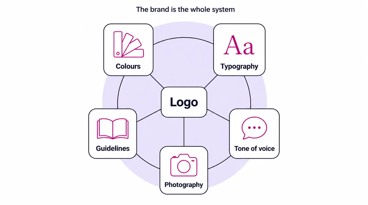
It cannot fix a price that is wrong for the market, rescue a service people were disappointed by, or persuade somebody who has never heard of you. Businesses that expect it to are usually solving the wrong problem, and the disappointment arrives about a month after the invoice.
| What you buy | What you get | Good for | Not enough when |
|---|---|---|---|
| A logo | The mark and its files | A new business that needs to exist visually | You compete with larger, better-presented rivals |
| A visual identity | Logo, colours, typefaces, simple guidelines | Looking consistent across everything you print and post | Nobody has decided who the customer is |
| Full branding | Research, positioning, identity, tone of voice, guidelines, applied everywhere | A working business that looks smaller or less credible than it is | The real problem is the product, the price or being found |
What a logo can and cannot do covers what to expect from one, and what to ask for alongside it so the money does more work.
Analysis before design, or you are just decorating
Design work that begins without research is guesswork with a bill attached. Before anything is drawn, four questions are worth answering properly.
| Question | Why it matters | How to answer it |
|---|---|---|
| Who exactly is the customer? | You cannot design for everybody | Describe your three best customers, by name, and what they have in common |
| What do they believe about businesses like yours? | You are designing against an expectation | Ask ten customers why they nearly did not buy |
| What do competitors look and sound like? | Looking the same makes you invisible | Screenshot five rivals’ signs, pages and posts side by side |
| What should somebody think within five seconds? | This is the actual brief | One sentence, specific enough to judge a design against |
That last one is the whole brief. If the answer is “that we are professional”, it is not specific enough to design against, because every competitor wants the same thing. “That we are the serious option in a market full of improvisers” gives a designer something to work with, and gives you a way to judge what comes back.
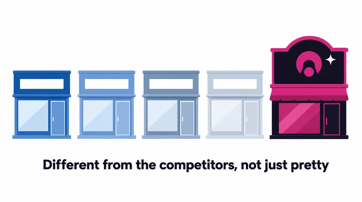
The competitor half matters more than people expect. If four rivals use blue and a plain sans-serif typeface, choosing the same makes you invisible in the one place customers compare you.
Choose colours and type you can still live with
Colour carries meaning and it varies by market, so test it on people who are actually your customers rather than on your own preference. What matters more than the specific choice is that you can reproduce it everywhere.
| Test | What to check |
|---|---|
| Phone screen | Does it look right on a cheap phone, in sunlight? |
| Does the printer match it, on ordinary paper? | |
| Photocopy | Is the logo still readable in black and white after a bad copy? |
| Small size | Can you read it as a 32-pixel profile picture? |
| Signage | Does it hold up on a painted wall or a banner? |
| Contrast | Is text on your brand colour readable? The accessibility standard asks for a contrast ratio of at least 4.5 to 1 for normal text |
Type is where most small-business identities quietly fall apart. Two typefaces are enough. They need to be readable at small sizes on a cheap phone, and available to whoever makes your posts next year. A beautiful typeface nobody else can install becomes an inconsistency the first week you are busy.
Choosing colours and fonts that still work in five years covers the practical tests in detail, including the ones involving a photocopier.
The five-year testBefore signing anything off, ask whether it will still look considered when the business is twice the size. Trends age fastest on the things you cannot cheaply replace, like signage and vehicle livery.
Name it for the business you are building
Names get decided emotionally and lived with practically. Before committing, check the boring things.
| Check | Where | Why |
|---|---|---|
| Domain | Any domain registrar | Your website address, at a price you would actually pay |
| Social handles | Each platform you will use | Consistency, so customers find the right account |
| Trademark | OAPI, the regional intellectual property office based in Yaoundé, and the WIPO Global Brand Database | So nobody else already owns the name in your market |
| Spoken aloud | A phone call with somebody who has never heard it | Can they spell it correctly? |
| Other languages | French, English and the languages around you | Nothing unfortunate hiding in a translation |
Be careful about naming yourself after one product or one city if you intend to outgrow either. Plenty of businesses here carry a name that quietly caps how far they can go, and renaming later costs far more than the domain would have.
Naming a business: what to check before you commit is the checklist version, in the order worth doing it.
Tone of voice: how the brand sounds
Most customers read your words far more often than they look at your logo: in WhatsApp replies, captions, quotes and invoices. Deciding how you sound is as much a part of branding as deciding how you look, and it costs nothing.
| We are | We are not | Sounds like |
|---|---|---|
| Direct | Abrupt | “It will be ready Thursday. We will message you when it leaves.” |
| Warm | Over-familiar | “Thank you for waiting. Here is what we found.” |
| Expert | Full of jargon | “The roof leaks because the flashing has lifted. It is a half-day repair.” |
| Honest | Negative | “That option will not suit you. This one will, and costs less.” |
Three or four pairs like these, with an example each, are enough for anybody who writes on your behalf to sound like the same business.
Consistency is most of the value
A modest identity applied consistently beats a beautiful one applied haphazardly, every time. Customers do not compare your logo to a competitor’s. They notice, without articulating it, whether your invoice, your van, your shopfront and your Instagram look like the same organisation.
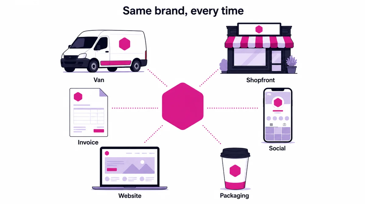
That is what brand guidelines are for, and why they matter more for a small business than a large one: you have fewer encounters with each customer, so each one carries more weight. Guidelines do not need to be a fifty-page document. One page will survive contact with reality better.
- The logo versions, and which to use where
- The colours, with exact values for screen and for print
- The two typefaces, and the sizes for headings and text
- How much space to leave around the logo, and the smallest size it can appear
- The tone of voice pairs, with an example each
- Three things never to do: stretch it, recolour it, or put it on a busy photo
What a full branding project actually delivers
Worth knowing before you commission one, because “branding” is used to describe both a logo drawn in an afternoon and three weeks of research.
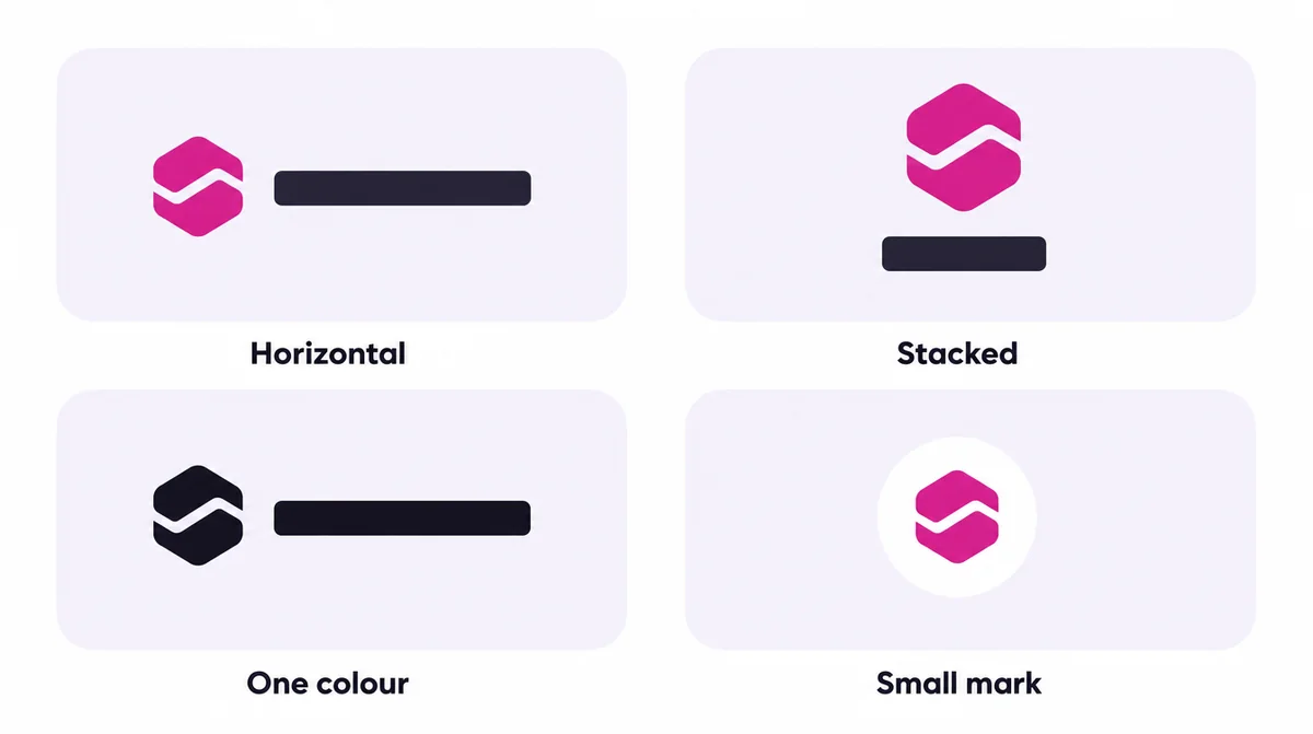
- The logo, plus the variations you will genuinely need: horizontal, stacked, one colour, and a small mark for a profile picture
- A colour system, with the exact values for screen and for print
- Typography: a heading face, a body face, and rules for sizes
- A tone of voice, with examples of how you write and what you avoid
- Guidelines, so the next person to make a poster does not invent their own version
- The whole thing applied to your website, invoices and social profiles
The last line is the one most often left out, and it is where the value lands. An identity that exists only in a PDF changes nothing about what customers see.
What you can decide yourself, and what to wait on
Plenty of this you can do without paying anybody, particularly at the start. Choosing the name is yours. Deciding who the customer is, and what you want them to think, is yours and cannot be outsourced usefully.
What benefits from a professional is the part that is expensive to redo: the logo files, the colour and type system, and the guidelines that keep it consistent. Those are cheap to get right once and painful to fix after they are printed on a shopfront.
If money is tight, a sensible order is: settle the name, pick two typefaces and two colours you can live with, apply them consistently everywhere, and commission the proper identity when the business can afford to do it once.
Rebranding without losing what you built
A rebrand is worth doing when the old identity is actively costing you, and dangerous when it is done because people are bored of it. Customers who recognise you now have to learn you again, so the change should be worth that.
- Keep what people recognise. A colour or a shape carried over makes the change feel like growth, not a different company
- Tell existing customers first, before they see a new sign and wonder if you were sold
- Change everything at once, or in a planned order, so you are not two businesses for a year
- Update every profile together: Google Business Profile, social accounts, WhatsApp, website, invoices
- Keep the old name findable for a while, so searches for it still reach you
Photography: the part of the brand customers see most
Customers see your photographs far more often than your logo: on your website, your Google profile, every post and every product page. Stock photos of people who are obviously not here undo whatever the identity achieved. Real photographs of your premises, your work and your customers do the opposite.
| Shoot | Why it matters | Where it is used |
|---|---|---|
| Your premises, inside and out | Proves you exist and helps people find you | Website, Google Business Profile, directions |
| Your work or products, in daylight | Shows the quality before anyone buys | Service and product pages, social posts, ads |
| The people who serve customers | Makes the business human and trustworthy | About page, team page, social |
| Customers using what you sell, with permission | Shows the result, not just the item | Homepage, case studies, ads |
| Details: packaging, uniforms, signage | Shows the brand applied consistently | Social posts, website |
Shoot them in one session with consistent light and backgrounds, and you have a library that makes everything else look like the same business. A phone in good daylight is genuinely enough for most of it.
Branding on a small budget: what to spend on first
Not every business can commission a full identity at once, and it does not need to. This is the order we would spend in, from free to the larger investment.
| Stage | What to do | What it costs you |
|---|---|---|
| 1. Free | Choose a name that passes the checks, two typefaces and two colours, and apply them everywhere | Time and discipline |
| 2. Small | A clean logo with the four versions you need, and a one-page guideline | A modest design fee |
| 3. Medium | Real photography of your premises, products and people | A day of a photographer, or a careful day with a phone |
| 4. Larger | Research-led identity, tone of voice, and everything redone to match | A full branding project, quoted in writing |
Whichever stage you are at, apply it to the places customers actually look: your website, your Google profile and your social pages. A brand that lives only in a PDF does nothing.
How to tell whether branding worked
Branding is harder to measure than advertising, but not impossible. Look for changes in how people respond, not in how much they say they like the logo.
| Signal | How to check it |
|---|---|
| People recognise you | Customers mention seeing you before: the van, the sign, the posts |
| Enquiries ask fewer basic questions | The brand and website answer them first |
| You win more of the quotes you send | Track the share of quotes accepted before and after |
| You can charge what you are worth | Fewer customers push back on price |
| Partners and larger clients take you seriously | Invitations to tender, referrals, partnership requests |
If none of those move after six months, the problem was probably never the brand. Our marketing guide covers what usually comes first.
When branding is the wrong thing to buy
We turn down branding work fairly often, and the reasons are consistent. If nobody can find you, SEO or advertising buys more. If the website loses people at the point of enquiry, fixing that page is worth more. If the product itself is not right, a new identity postpones the problem at your expense.
Branding earns its money when the business works and looks smaller or less credible than it is. That is a real and common problem, particularly for businesses competing against larger companies for the same customers, and it is fixable. It is just not the first problem most businesses have.
Where this comes from
The primary sources behind the claims above. Each one is worth reading in full if you want the detail.



If you would rather not do it yourself
See our branding service
If you want the whole identity built on research rather than taste, that is what we do, and we will tell you honestly if your money is better spent elsewhere first.
Questions
The things people ask first.
Branding is everything a customer uses to decide whether to trust a business: the logo, the colours, the typeface, the tone of voice, and how consistently they appear. A brand analysis checks what your market already thinks first, so the design work is based on evidence rather than taste.
No, and the gap between the two is where most disappointment lives. A branding project delivers the logo and its variations, a colour system, typography, a tone of voice, written guidelines, and all of it applied to your website. A logo alone makes you recognisable, nothing more.
A logo alone is the cheapest piece and the least useful on its own. A full identity with research, colour, type, guidelines and application costs more because most of the work happens before anything is drawn. We quote in writing after the first conversation.
Yes, and sometimes that is genuinely the right purchase, particularly for a new business that needs to exist visually before it can afford more. We will say so rather than upselling you into an identity project you are not ready for.
Start from what you want somebody to think, check it against your competitors so you are not invisible beside them, and test it on actual customers. Then make sure it reproduces everywhere, and that text on it is readable: the accessibility standard asks for 4.5 to 1 contrast for normal text.
Trademarks for Cameroon are registered through OAPI, the regional intellectual property office based in Yaounde, which covers its member states together. Search its records and the WIPO Global Brand Database before you commit to a name, and take advice on registering it.
One page is enough for most small businesses: the logo versions and where to use each, colours with exact values, two typefaces and sizes, the space around the logo, tone of voice examples, and three things never to do with the logo.
Only if the current identity is actively costing you: it makes you look smaller than you are, it no longer describes what you sell, or it cannot be reproduced consistently. Rebranding because you are bored of it is the most expensive reason there is.
Next step
Tell us the goal. We will come back with the plan.
No pressure and no obligation. Start with the free audit, or send us a brief and get scope, timeline and cost in writing.
